Thursday, 22 September 2011

My own Soliloquy Analysis

“She should have died hereafter;
    There would have been a time for such a word.
    To-morrow, and to-morrow, and to-morrow,
    Creeps in this petty pace from day to day
    To the last syllable of recorded time,
    And all our yesterdays have lighted fools
    The way to dusty death. Out, out, brief candle!
    Life's but a walking shadow, a poor player
    That struts and frets his hour upon the stage
    And then is heard no more: it is a tale
    Told by an idiot, full of sound and fury,
    Signifying nothing..” 

The climactic scene when Macbeth learns of the death of lady Macbeth is a scene equal in the desolation that Macduff experiences when he learns of his wife's death. Macbeth cannot set his grief in perspective and he does not react with the disbelief Macduff shows but accepts it wearily.
The action of the scene shows how closely the Witches control Macbeth's fate and the action of the scene is projected onto settings and characters that have been visibly drained of their energy. Macbeth who was so bound by his own power is stripped to barest of essentials that are faded ghosts of their former glory.
As a climactic scene the news of Lady Macbeth's death is a turning point in which Macbeth's choice of either a faded existence at the hands of the Witches or a last act of self will is made clear. He realizes that his newfound power is not worth the price it has cost him. Taking his crown he hurls it away to have it return to his feet. The consequences cannot be escaped.

I chose an image by a famous photographer named Duane Michals. Duane Michals merges writing and photography into highly distinct and original bodies of work. Fed by literature, poetry, philosophy, film and art history, Michals moves between a melancholic gravity and a fanciful humor.

I believe this image is a reflection on Macbeth’s soliloquy over the news of his wife’s death. The three figures to me symbolise the three characters. Macbeth far left, Lady Macbeth Beside him and on the far right entering the image is Macduff. The two figures in the centre are stripped of their clothes this could symbolise their loss of innocence and good which has been erased and transformed into bitterness and evil. The dull colours of the photo are cliché as black and white symbolise passivity giving a negative vibe to the image. The women is leaning upon the man this could symbolise a desperation for grief as throughout the play Macbeth left his wife alone to go mad and to commit her own death. However the man does not seem to be responding to the women and seems to have a vague outline of him drifting. This could be a symbol for Macbeths belief that we live in a meaningless universe as his face seems deflated and lonely. This could also symbolise the separation of Macbeth from Lady Macbeth as he seems heartless to the news of her death the word “Tomorrow” could be a metaphor for the thought that everyone has to die. Another reasoning to him that life is meaningless.

I want to expand on this soliloquy project by experimenting with different images that could link with my chosen quotation. I also want to merge text into the images to create a distinct image that reflects on the play of Macbeth.

I found this image by a photographer named Gregory Crewdson. Gregory Crewdson's photographs usually take place in small town America, but are dramatic and cinematic. They feature often disturbing, surreal events and his photographs are shot using a large crew, and are elaborately staged and lighted.


The mood of the image is very cinematic in the way the light reflects off the rain as it falls and glistens on the ground. It seems beautiful but the mood of the image is solumn and depressing. The deserted area gives a sense of isolation towards the figure in the centre.

the mans body language and facial expression seems to be curious yet dissapointed. He seems to be catching the rain in his hands. It can be interptreted that he is looking at the rain in disgust or as though it is pointless. This could link with the line ...
 "it is a tale
    Told by an idiot, full of sound and fury,
    Signifying nothing..” 
As macbeth thought that we live in a meaningless universe. It can also be interpreted as a metaphor for grief. this could link with the grief that Lady Macbeth seems to desperatly want from her husband. The  rain could symbolise her, however the mans hands are open so the rain just slips through his fingers like the memory of Macbeth's wife.

Before
After

One of my key interests this year is fashion photography, so I wanted to find a fashion photo that i could link with this soliloquy project. one of my favourite fashion photographers is Nick Knight ...
Nick Knight is a British fashion photographer, documentary photographer, and web publisher.
In November 2000, Knight launched SHOWstudio.com , an online fashion broadcasting company committed to pioneering, live fashion media. SHOWstudio.com has broken new ground with its experimental interactive projects, films and live performances. Its collaborations with influential cultural figures, from Björk, Boy George, Lady Gaga, Gisele Bündchen, Kate Moss and John Galliano to Leigh Bowery, Heston Blumenthal and Antony & the Johnsons, are broadcast live.

two of his photos jumped out at me, which I thought could link to the character of lady macbeth and the emotions macbeth feels for her in this soliloquy.


I thought both these photos express the emotions felt by Lady Macbeth from the words her husband speaks.

"She should have died hereafter;
    There would have been a time for such a word.
    To-morrow, and to-morrow, and to-morrow,
    Creeps in this petty pace from day to day"


The top image to me expresses her emotions through her body language. The way she stands awkwardly with her head lowered and her legs bent reminds me of grief as she seems to be holding her stomach, as though she has been winded. this reminds me of the choking feeling you get when you are hurt through someones words. this could be a metaphor for how she felt when her husband said those words. allthough the purity of the background and her dress symbolises peace and tranquality, to me this is a symbol for the harmony she feels as her suicide took her away from the nightmare she was living.

"The way to dusty death. Out, out, brief candle!
    Life's but a walking shadow, a poor player

...
Signifying nothing..” 

The second image to me signifies macbeths belief that life and the universe is meaningless. If life is meaningless to him then that must mean his wife was meaningless to him too. The model is overwhelmed by a collection of fabrics which look like hair and netting. The contrast between the sweet blue and the harsh black to me symbolise the differnece between the nightmare she felt when she was living and the peace she probably feels now she has escaped. however she is still smothered and all of her that can be seen is her legs. The fact her identity is hidden symbolises that she is just another person nothing special. To me this is a metaphor for macbeth's belief that "Life's but a walking shadow" that is "signifying nothing..." just like his wife. 

I decided for the first image to place the scriptions on the wall as though carved by her own hands that were covered in the blood of duncan. I created two versions of the image using photoshop. It took a while to place all the words on the wall as i had to dublicate each layer. after placeing them on the wall I dublicated the bvackground and rubbed out the words that overlayed the models dress. after doing so the layer with the words opacity was lowered so they did not appear to bold so that it drew the eye away from the model. After completing this i decided to use a filter called "cote crayon" whcih created a disrted effect on the image. this appealed to myself and my goal in manipulating the photo. I wanted the contrast the purity of her death and the nightmare of her life into one image. I print screened the process and created two final outcomes. 


I didnt want to overwhlm the second image, i just wanted the words to be manipulated into the image in a subtle way. by rasterizing some text and greatly contrasting the image i ended up with this 


Overall my favourite and most relatable image to the soliloquy task is the two black and red vulnerable girl images. these are my final outcomes ...


Analysis of Literature and Photography

Act 1 Scene 5 – Macbeth By William Shakespeare 

Lady Macbeth - “The raven himself is hoarse
    That croaks the fatal entrance of
Duncan
    Under my battlements. Come, you spirits
    That tend on mortal thoughts, unsex me here,
    And fill me from the crown to the toe top-full
    Of direst cruelty! make thick my blood;
    Stop up the access and passage to remorse,
    That no compunctious visitings of nature
    Shake my fell purpose, nor keep peace between
    The effect and it! Come to my woman's breasts,
    And take my milk for gall, you murdering ministers,
    Wherever in your sightless substances
    You wait on nature's mischief! Come, thick night,
    And pall thee in the dunnest smoke of hell,
    That my keen knife see not the wound it makes,
    Nor heaven peep through the blanket of the dark,
    To cry 'Hold, hold!'”

An interpretation of Lady Macbeths Soliloquy is that it could symbolise her transformation from being a loving wife and honourable women to a sinister and dark lady in black. Through this soliloquy she is giving or sacrificing herself to dark nature. She wants everything good in her to be sucked out and replaced with bitterness and evil. The word “hold” at the end of the soliloquy can be portrayed as a command to God. She doesn’t want him to stop her from doing wrong. 


This is a photograph taken by photographer Annee Olofssn which I have not researched or even found the name of as I wanted to analyse it myself and portray the meaning or narrative to the image. 

 
A dark background adds to the intensity of an image. The black background contrasts with the light colours of the girls hair and clothes. I feel a sense of irony from the colour palet. The blonde hair and pastel top add a sense of inncoence to the figure and to the photo. However there is  a sense of invasion from the hands latched onto her arms. There is no knowing who the hand belong to, and the fact they are hidden beneath her clothes also hides the identitiy of the hands. They almost seem ghost like due to the pastel top, which could link with Lady Macbeths Soliloquy. The hands seem to be wanting to pull the women, who seems inncocent and naïve, into the dark. This links to Lady Macbeths need to be released of her innocence and kindness and unceiled into a darker nature.


What is a Soliloquy


A Soliloquy is a device often used in drama whereby a character relates his or her thoughts and feelings to him/herself and to the audience without addressing any of the other characters which is different to a monologue which are used when the character may be speaking his or her thoughts aloud, directly addressing another character, or speaking to the audience 

Soliloquy’s express a characters honesty and tell the truth. Soliloquy’s are never changed no matter who or what the character is addressing as it is an honest refelction of their thoughts, feelings, and emotions. They express a characters honesty as they are always truthful. A soliloquy can be seen as an ungarded mind as characters confess to the audience which may make the audience feel contaminated or uncomfortable as they no something other characters do not.

There are two different types of Soliloquy’s Public and Private. Public soliloquy’s are ususally spoken by Villians or comical characters, as they inform and entertain the audience whereas a private soliloquy is usually spoken by a troubled character which makes an audience feel like they are eve’s dropping or in vading the characters personal thoughts. 

Self Portrait Task - Influenced by JR continued

Self Portrait Task - Influenced by JR


JR wanted to change the world with his photos, he wanted people to see the world for what it really is and hoped to make a differnce to peoples lives.

Our project however is based on oursleves. We were set a task to take an image of oursleves that shows an honest portrayal of our own personalities.
These are three images I chose that I think personaly represent myself.

the top image shows my insecurities my face is hidden  Others think I am a confident and energetic person, but deep down i have so many insecurities that my confidennce is non existant.
In the second image i am also hiding behind my hair due to my insecurities but also i am crouching my shoulders as though I am trying to protect myself. I am a friendly person however I am not open to others due to past experiences that have lead me to only trust myself. I believe my body language expresses my need to keep myself to myslef, however in the photo i am smiling a little. To me this symbolises, that even though im insecure and afraid to trust others I am happy
The last image shows the "meg face" (as everyone calls it) in nearly every photo that is taken of me i stick out my toungue. I think this shows the me that everyone else sees, the stupid, clumbsy, naive, ditzy meg. 

I wanted to gather all of these element sof myself into one photo so I chose this one. I also wanted to reflect on my top. Which reads "I was your boat, you were my sea, together we'd float so delicatly" it is a song by a favourite band of mine that means a lot to me.


JR - a tale of commitment, freedom, identity and limit.

He exhibits freely in the streets of the world, catching the attention of people who are not the museum visitors. His work mixes Art and Act, talks about commitment, freedom, identity and limit.
After he found a camera in the Paris subway, he did a tour of European Street Art, tracking the people who communicate messages via the walls. Then, he started to work on the vertical limits, watching the people and the passage of life from the forbidden undergrounds and roofs of the capital.
In 2007, with Marco, he did Face 2 Face, the biggest illegal photo exhibition ever. JR posted huge portraits of Israelis and Palestinians face to face in eight Palestinian and Israeli cities, and on the both sides of the Security fence / Separation wall. The experts said it would be impossible. this lead him to brak the barrier and present an even bigger concept of art
In 2008, he embarked for a long international trip for "Women", a project in which he underlines the dignity of women who are often the targets of conflicts. Of course, it didn't change the world, but sometimes a single laugher in an unexpected place makes you dream that it could.
JR creates "Pervasive Art" that spreads uninvited on the buildings of the slums around Paris, on the walls in the Middle-East, on the broken bridges in Africa or the favelas in Brazil. People who often live with the bare minimum discover something absolutely unnecessary. And they don't just see it, they make it. Some elderly women become models for a day; some kids turn artists for a week. In that Art scene, there is no stage to separate the actors from the spectators.
After these local exhibitions, the images are transported to London, New York, Berlin or Amsterdam where people interpret them in the light of their own personal experience.
As he remains anonymous and doesn't explain his huge full frame portraits of people making faces, JR leaves the space empty for an encounter between the subject/protagonist and the passer-by/interpreter.
This is what JR is working on. Raising questions...
JR currently works on 2 new projects: Wrinkles of the City which questions the memory of a city and its inhabitants and Unframed, which reinterprets in huge formats photos from important photographers taken from the archives of museums.
 

Wednesday, 21 September 2011

New Bench Mark

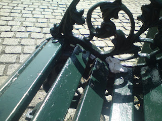
Every Bench has a collection of memories. Some are marked and some have little souvenier's, like this one. a yummy tissue. To me benches are a lonely place to sit and reflect. I never realised how much company benches have in a day untill i actaully sat down and documented the people who visited in a time space of 20 minutes.
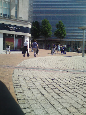
Whilst sitting on a bench in bournemouth I met a nice couple. I decided to record my conversation with them but i didnt catch there names as i was interupted by two students who asked me questions about food. A bit strange, but i went along with it. This is an image i took of the cuple i didnt wan tto take a snapshot as first of all i was shy to ask and i wanted to capture their natural body language and facial expression. I took the image and noticed that they had exactly the same facial expresssion, a comical image.  >>>> 

 I took a few more images whilst waiting for a friend. as i wanted to capture the differnt characters who visited the lonely bench ...


I went to the Great Dorset Steam Fair with a friend. I wnet to experience the night life of the fair, i tried to capture an image of the miles and miles of lights form caravans and the rides... instead i found this image of the night time atmosphere of the fair

I experienced an amazing night where i met many gypsies, farmers, engineers and unique characters. What i noticed though was at night the fair was alive and colourfull. you could hear screams of joy, laughter, banter and see smiles all around. However in the day that all changed.
I took three images of people sitting on benches in the arly morning. There is an obvoious change in atmosphere over night as my images are dull form the smoke from the ngines spreading across the sky. Every character in my photos are miserable and tired, even the wood of the benches are dull and boring in contrast to the bright lights from the funfair,

"The Jeremy File Share"

The First thing to do was to think up a title for the show that linked with the computer theme. We created a brainstorm of words that linked to the subject like "Wire" "plug" "hard-drive "file" "link" etc.. and after putting some words together we came up with "THE JEREMY FILE SHARE"
At the begining of each show titles run up with the "Jeremy Kyle" logo. we wanted to use the logo to introduce or open our own show. So we used photoshop to edit the logo ...


After creating the logo we needed to Photograph the computers. we wanted to find an area in the school whcih could be seen as a studio. Fortunatly we have a theatre with folding chairs and stairs which were perfect for the scene's. We wanted to set the computers up as though they were all in the studio, however we thought of a comical idea of having one of the computers at home on a webcam. (Relatable to the theme)

After Photographing the computers we needed to make personalities for them. We decided first of all The "Jeremy" PC should be the black computer in the studio as it is shiny and safisticated. the second computer was the small white netbook. this was to be the vulnerable girl. And the final computer would be the aggresive and lazy boy as the computer is set in a messy room and has a dark screen.

after figuring out which computer was which we neede a "jermy kyle show" story we came up with a brainstorm and a list of differnt stories

Pregnancy
Cheating
lying
Money Issues
Drugs
Alchol
Parent Issues
Family Issues
STD's

After a few arguments and a long discusion we decided to base the storyline on STD'S or in computer terms a virus. we thought this was the best idea as we came up with a few comical lines that could easily relate to the subject. After writing the script we needed to record the voices. fortunatly we had a friend who was studying music tech and helped us out with the mixing and recording. Seeing as there were three of us we each were given a computer to do the voice off
Jeremy Kyle was offered to Emma, as she seemd to be the strongest speaker and had a extrovert perosnality
The boy computer(Advent) was given to Aaaron as he was th eonly boy in the group and had a deep voice wchih would suit the character
and the last computer (sony) the girl was given to me, as I'm a girl and I have a lisp which added a bit of character to Sony.


After finalising the recording and editing the sounds we decided to create the film in Movie Maker, Me and Aaron spent our study period editing the image sinto the right place to suit the audio and create comical effects we also added the running titles and a caption to add more of a tv show style to the film. When all was completed we created credits and thanks at the end.

Finaly Finished this is our FInal film
"The Jermey File Share"
By Emma Butler Aaron Quinn and Meg Lavery


The Jeremy Kyle Show - A bit of Research

The Jeremy Kyle Show is a British daytime television tabloid talk show  presented by Jeremy Kyle that has been broadcast on ITV since 4 July 2005.The show is characterized by its confrontational style, which sees guests attempt to resolve issues with others that are significant in their lives, such as family, relationship, sex, drug, alcohol and other issues.Frequently, guests display strong emotions such as anger and distress on the show, and Kyle is often harsh towards those that he feels have acted in morally dubious or irresponsible ways, whilst strongly emphasising the importance of traditional family values. This has led to both criticism and parody of the show in newspapers and on television, and even led to the show being described as "human bear-baiting" by a Manchester District Judge, during a prosecution after guests had been involved in a violent incident on the show.

Wednesday, 14 September 2011

The big Idea

Due to similar interests in research, I teamed up with two other class mates to create a final film. We all loved the style and comedy of "Creature Comforts" and "The Natural Confectionary Company" advertisements so we wanted to take those elements and form our own short film. 

We wanted to use the concept of photographs rather than using an actual film Camera. We chose to use images as we believed photographs have a much more comical effect in films due to the change in depth of field and the way the pictures flick from one character to the other... so all in all we knew we wanted to create a comical animated film using photography. But what could it be about? 

 We wanted to focus in Inspirations or a narrative from Tv shows such as "Top Gear" "The Jeremy Kyle Show" and "Mock the Week"
 
Many Programmes and movies have been made to mock TV programmes, films, or even types of cultures such as "Epic movie" "the Impression Show" and "Little Britain.As a group we knew what we wanted and thought about making a mockery of a programme. We first needed to decide what to use as our characters or subjects. 
One of our group members"Emma" had a high interest in computers. First of all we thought of creating a film with a similar concept to creature comforts where Animals talk, Complain, Argue and discuss certain topics but instead we would use computers. As we researched into the film we already came up with a few lines
"Im not anti-social, im just not user friendly"
"(Computer not responding)I'm just ignoring you"
"Your homepage or mine"

Idea 1 
Computer Personalities 
We first came up with an idea based on computers personalities. All computers look differnt so their personalities can be based on the way they look and also what their voices sound like. For example, an old Desktop could have the personality of an old grumpy man, or a bright pink laptop could have the personality of a girly girl. Fro this we could create a film similar to that of "Creature Comforts" but full of computer banter. The topic of the show could be based on how computers are treated and like creature comforts would be interviewed by the people who treat them theat way.

Idea 2

Spoof of Famous People
Our Second idea was to create a spoof of a famous peopleand the first one that came to mind was "Jeremy Clarkson". This was due to his hilarious catch phrase which we had already came up with a line for 
"The Biggest hard--drive ........ In the wooooorld"
However after finding a sline for "Jeremy Clarkson" we couldnt think up of any more hilarious jokes or spoofs linked to computers  

Idea 3 
Spoof of The Jeremy Kyle Show 
Our final idea was definatly our favourite. Due to the entertaining atmosphere and storyline of the show we thought it would be a comical and fun film to create. The idea was to set up interviews with computers, where they speak about their problmes and try to resolve them.


Creature Comforts

Creature Comforts was originally a 1989 British humorous animated short film about how animals feel about living in a zoo, featuring the voices of the British public "spoken" by the animals. It was created by Nick Park and Aardman Animations. The film later became the basis of a series of television advertisements for the UK Electricity Board, and in 2003 a television series in the same style was released.  
 The original 5-minute film Creature Comforts was conceived and directed by Nick Park and produced by Aardman Animations featuring the voices of British non-actors in the same vein as the "man on the street" Vox Pop interviews. It was produced as part of a series called Lip Synch for Channel 4. The film won Nick Park the Academy Award for Best Animated Short Film in 1990.


"Look It's a CATONKEY" !!!!


The Natural Confectionary Company is a food retail company that sells, sweets sours and chocolates. Over the years their advertisement has developed into comical films, based on the conversations and realisations of individual sweets.
Every film is set on a clear white surface, sometimes props are used but most of the time it is just the individual characterised sweets. The adverts are not filmed trhough a video camera, but are actually photographs edited together to create an animation.


As the simple adverts have always entertained and interested me I would consider my short Forward Motion Film to be an animation. I like the adverts due to the simple and quaint sunbject. I also noticed that the voices of the sweets characterise them and give them a personality. If i was to make a similar animation, I would have to consider using particular voices for characters. Another element I like to the adverts are the angles of the images and the way the images flip from one character to another. This seems to emphasise the characters personality, and exagerate arguments between the sweets.


Forward Motion short Films

Forward motion creates a moving snapshot of Britain’s prolific screen dance output. A British Council project
co-produced with South East Dance and supported by Arts Council England; the collection has been curated by an expert committee comprised of representatives from these three organisations alongside artists, producers and academics.
Along side other students, as part of the photography class, I visited the Pavilion in bournemouth to view some short films that were entered into the Forward Motion Festival competition. Each of the videos were based on the subject of Dance. There were eight films, "Touched" by David Hinton and Wendy Houston,"The Incomplete autobiography" by Rajyashree Ramamurthi, "Sardinas" by Lea Anderson, "Basini" by Liz Aggiss and Billy Cowie, "Tra La La" by Magali Charier and Viv Moore, "Line Dance" by Alex Reuben, "Gold" by Rachel Davies and Hanna Gilgren and "Motion Control" by David Anderson, Liz Aggiss and Billy Cowie.
My Favourite of the Eight was by far "Touched". "Touched" (1995) is a short dance film created in collaboration with choreographer Wendy Houstoun, which is one of his experimental dance films created entirely from library footage, the latter in collaboration with choreographer Rosemary Lee. A romance for hands and faces - and the odd foot, this video is the choreography of close-ups set in a bar in north London. The characters talk, smoke, drink, dance, fight, laugh, and weep.               


"I think making dance films are probably the most interesting films you could possibly make. On a very fundamental level, making a film and making a dance are a very similar kind of activity; they're both about giving structure to action. If you think of film as just a formal language, and you forget about the acting and the talking you can look at any film as a dance film. All films take images of action and try to put these images together in a rhythmic and expressive way. In this sense film and dance work along the same lines." – David Hinton

The reason Why i favoured the film "touched" is becasue of the use of a simple subject that is turned into a complex choreography and then a dramtic exagerated film. Each movement the dancers make is exagerated, for example in the film a man whispers to a lady and when he does so, her head sweeps back and travels with his lips. Another element i liked was the focus of the camera. it seems at first there are only two people in the bar but when the camera focuses and zooms it reveals more and more hands touching, lips speaking, fists fighting and people dancing. The film does not have any musical audio over it, but has the sounds of chatter and whispers, also some parts (where hand gestures and touching is exagerated) there are sounds of skin touching and hands tapping.