Wednesday 16 November 2011

Experimenting

In all of the images I have found appealing and inspiring, the texture is the main focus. The movement of hair, of the body and of garments. Distorted effects manipulated onto the image. The effect of a liquid thrown at models.  I could incorporate all these aspects of fashion photography into my own fashion shoot to create my own set of  images that I an be proud of.
but before I leap straight into it i want to experiment with movement, liquids, and any other textures that I could incorporate into a fashion shoot.

For the first experiment I wanted to visualise the diffusion of ink in water. I used a small clear plastic cup so I could capture the movement of the ink in the water. it was only an experiment so i only used a little lamp for my lighting and a sheet of white paper to place the cup on.  I had a friend help me pour the liquid in as I took the snap shots. I loved how the colours varied from light to dark and the ink moved in an abstract way. the texture is beautifull and if i took a few images of profiles, or fashion photos, i could manipulate the liquid onto the image to create images similar to "Pirelli's Calendar" to give a distorted effect to a profile image.

I decided to experiment with movement as when taking images of models the movement in their hair can distract the viewer as strands may be in front of the face, or the texture and shape of the hair may not suit the image. I decided to do some hair wipping just a fe littel experiments with a few volunteers.


One of my favourite images was of two of my friends, Sean and Jonny, who both have extremely curly hair. i thought it would be perfect as the texture of their hair makes the movement much more detailed.


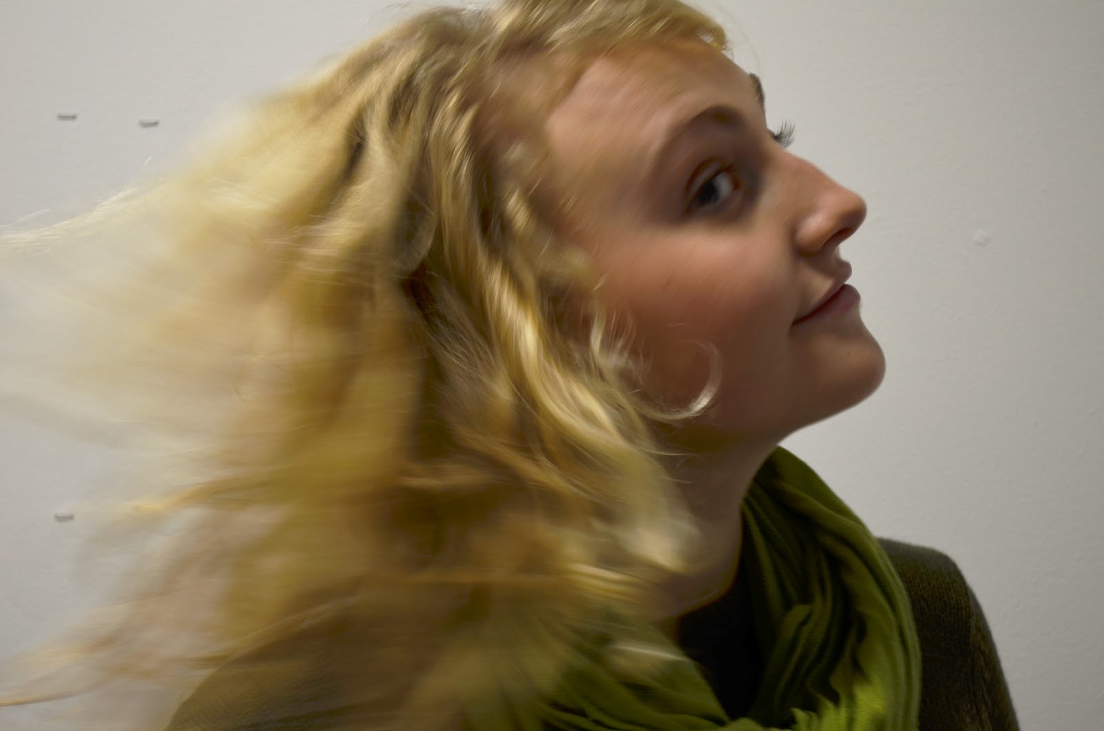
I also experimented with the shutter speed to see if i could capture the movement in progress. I had the shutter speed on 2 and took the photo as her head sprung upwards and ended up eith this. i thought the opacity of her face made the image more elegant but i think the eye is to drawn to her back as the colour palet is much darker.
After some hair wipping I went out with three friends to Mudeford Quay. It was a realy clear day but with strong winds which was ideal for my hair experiments.


I wanted a nice backdrop behind my friends so as we walked right by the harbour i chose to taek the shots. I didnt want them to pose or look too structured so as they were wondering around I just took the shots as the wind blew through their hair.
The natural light added shadows to her skin and brought out the structure of her face but also added highlights to the differnt strands of hair. i would love to do a massive fashion shoot on a windy sunny day to capture the abstract texture and natural lighting in the images.
My friend Aaron was just wondering about and i took a sequence of images as he stood in front of the backdrop of hengistbry head. this one was my favourite due to the spikyness of his hair. i also like how the light doesnt shine on him, but only on hengisbry head.  Also i love the contrast of the lighter background and the darker colour palet of the model.

I also took a photo of my freind emma but i wanted a close up and just a simple coloured backdrop so the eyes attention was focused on her hair. It was taken whilst along the beech with just the blue sky as a backdrop which I thought made the photo much simpler and made the differnt stands of hair more visible. Also thelighting is quite simple due to the sun shining on her face like the one of rachel the structure of her face is outlined by the shadows.

Dirty Sexy Things

The name pirelli seemd to remind me of a photographer named perou, who made a television programme for his exhibition of 8 great models and 8 great photos on channel 4

Dirty Sexy Things -Channel 4
Leading fashion photographer Perou creates a series of photographs with eight models from across the globe that opens a window on the world of modelling and reveals what life is really like in an industry that commodifies beauty.
In all of his photos props were used to add visual narrative to his images, such as the snake and the paint above. without the props these images would be simplistic and, to me, boring. I love the idea of adding more intensity to an image by making the model fit around the effects of the image. i would love to experiment and explore with surreal hair and makeup with my models. Maybe using matter such as glitter and water would add an amazing effect to my images adding more of a narrative to build around.

Monday 14 November 2011

Nick Knight's Pirelli Calendar

For the 2004 Pirelli calendar, photographer Nick Knight and art director Peter Saville shifted the focus from men's desires to those of women. From fourteen conversations with eminent women, Knight constructed narratives for each month based on their most intimate sexual fantasies. The specific author of each remains a secret, but their fantasies are explored in groundbreaking interactives.


Knight, the British photographer who has produced some of the most subversive fashion images of the past 15 years - for the Florence Biennale in 1996, for instance, he photographed fashion designer Alexander McQueen's head apparently being ripped apart - had already turned down the commission several years ago.
"I'd entertained the idea of doing Pirelli before but said no," Knight says, carefully. "I felt there is an argument that the calendar produces demeaning images of women. I don't believe that is entirely true, but there is an element of truth there. I decided if I was going to do the calendar, I was going to try to change it in some way." So he talked to his friend and collaborator, art director Peter Saville, who has worked with pretty much every major fashion designer, along with bands such as Joy Division, New Order and Roxy Music. Saville thought about it for a while and, drawing on his skill at deciphering modern imagery, decided the calendar was, in fact, "an institution of the 21st century" and more than just a girlie calendar.I had lengthy phone conversations, a lot of them very late at night, with these famous women, when I was asking them to tell me: 'What are your thoughts about sex? What are your fantasies?' ," Knight says as we sit in bright autumnal sunshine in his family kitchen in Surrey.
For his Pirelli, Knight made one promise to his confidantes: that he would never reveal whose fantasy was whose. We'll never be certain who said what. Which makes for tantalising viewing as Knight sits at the kitchen table with the calendar in front of him, going through his images, month by month, fantasy by fantasy.So, this (June) was a very specific fantasy. It was about making love in a meadow to an Asian girl," he says, gently. I look and, oh yes, there are two women in a mirage of flowers.

He turns a page "This particular person talked to me about her thoughts on being naked by the light of the moon in a nest at the top of a tree." And there (January) lies the Russian model Natalia curled up on a bed of eiderdown.
He turns another page. "This one (April) is the fantasy about being in a lift and five firemen get in . . ." he trails off and smiles at me. I look closer, and behind the image of a woman wearing thigh-high boots I can make out the suggestion of contorted torsos, limbs and helmets.
Some of the women's fantasies are more explicit. One woman told Knight she fantasised she was Messalina engaged in a shagging match in Imperial Rome, so Knight photographed the model Karolina Kurkova rising victorious above an orgy of her exhausted rivals (October).
Another woman simply told him she dreamt of being the centre of men's desire, wanting to please all of them, all at the same time. Knight's interpretation (December) has the model Pollyanna on a swing as if performing in the round to a group of lechers.
Knight hired a film studio for eight days and closed the doors. His team built the elaborate sets that each woman's fantasy demanded.
The retouching and computer-generated effects that have become synonymous with Knight's work - the "melting" of large areas of the photograph - took two months in post-production.
When they were finished, Pirelli baulked, realising these images were much more sexual than usual. Now, however, the executives say they are delighted with Knight's calendar, which, their spokesmen believe, "blends art with seduction".

The Face's of Fashion

I wanted to take a more detaile dapprooach into the research of fashion photography so I found a few photographers and artists that's work inspired me and gave me a few ideas for my own shoots.

Guy Bourdin
Guy Bourdin was a french fashion photographer. Bourdin was the first photographer to create a complex narrative, then snatch a moment sensual, provocative, shocking, exotic, surrealistic, sometimes sinister and simply associate it with a fashion item. The narratives were strange and mysterious, sometimes full of violence, sexuality, and surrealism. Bourdin was influenced by his mentor Man Ray, photographer Edward Weston, the surrealist painters Magritte and Balthus, and film maker Luis Buñuel. Even though much less well known to the public than his colleague Helmut Newton (also working for Vogue), Bourdin possibly has been more influential on the younger generations of fashion photographers.
Guy Bourdin was a short man with a whiny voice, and had a reputation of being incredibly demanding. Dark rumours surrounded him: his mother abandoning him as an infant, the suicides of his wife and two of his girlfriends, and the cruelty in which he treated his models.

What i like most about the work of Guy Bourdin is the surreal and shocking images he produces. most of his work is related to sexuality and violence which adds a more sinister theme to his photos. I love how his photos have narratives and a story behind them which usually were stories of a darker and sinister nature.


Nick Knight
Nick Knight is one of my biggest inspirations his work just jumps out at me due to the unique and unusual compositions of his photos.  I love the bright colour pallet used to make his phtos more surreal and how hw consistently challenged conventional notions of beauty.  His first book of photographs, skinheads, was published in 1982.  He has since produced Nicknight, a 12 year retrospective, and Flora, a series of flower pictures. He has also photographed many celebrities such as Lady Gaga, Christian Dior, Alexander McQueen, Calvin Klein, Levi Strauss, Yohji Yamamoto and Yves Saint Laurent.


 Vogue
Both photogrpahers have doen work for vogue magazine.Vogue is a fashion and lifestyle magazine that is published monthly in 18 national and one regional edition by Condé Nast.Vogue was described by book critic Caroline Weber in The New York Times in December 2006 as "the world's most influential fashion magazine".
Fashion news daily, catwalk videos, backstage photos, fashion trends, supermodel interviews, beauty trends and celebrity party photos.

Knight :
Nick Knight is top of the celebrities' photographer wishlist. His reputation for pushing boundaries technically and creatively at every opportunity and being at the forefront of innovation is deeply attractive. He has worked on a range of often controversial issues during his career - from racism, disability, ageism, and more recently fat-ism. He continually challenges conventional ideals of beauty. He once said: "I don't want to reflect social c
Nick Knight is top of the celebrities' photographer wishlist.


Bourdin:
Bourdin, born in Paris in 1928, was the pioneering fashion photographer of the 1970s whose arresting photographs filled the pages of French Vogue for three decades. His work completely re-shaped the ‘fashion picture’ and today his legacy lives on in ad campaigns the world over. Bourdin abandoned the traditional tendency to present the product in an elegant, safe manner, and instead chose to stimulate consumer desire by using models to create intriguing and provocative narratives.
With his photographs, he sought to shock and to play on people’s curiosities, staging unsettling scenarios that hint at violence, sex and death. If sometimes troubled, Bourdin was not, however, relentlessly dark. The resulting images are colourful, decadent, often humorous and playful.
Guy Bourdin was Man Ray’s protégé and the spirit of the Surrealists is ever-present in his work - evident in the dream-like quality of some photos and in the artist’s use of uncanny juxtapositions. Moreover, he cleverly fused a very European aesthetic with that of the post-war Pop culture of west coast USA. Of the former, influences include Alfred Hitchcock, Jean-Luc Godard and even Lewis Carroll. Of the latter we see hints of Marilyn Monroe’s glamour and sex appeal and Andy Warhol’s stark colour palett


Wednesday 9 November 2011

RayGun Magazine

Ray Gun was an American alternative rock-and-roll magazine, first published in 1992 in Santa Monica, California. Led by founding art director David Carson, Ray Gun explored experimental magazine typographic design. The result was a chaotic, abstract style, not always readable, but distinctive in appearance. That tradition for compelling visuals continued even after Carson left the magazine after three years; he was followed by a series of art directors, including Robert Hales, Chris Ashworth, Scott Denton-Cardew, and Jerome Curchod.
David Carson  is an American graphic designer. He is best known for his innovative magazine design, and use of experimental typography. He was the art director for the magazine RayGun. Carson was perhaps the most influential graphic designer of the 1990s. In particular, his widely imitated aesthetic defined the so-called "grunge typography" era.
"Grunge Typography" is a unique style of typography that makes words stand out. David Carson provides pieces with a grunge edge and retro touch, typically with big fonts, straight lines, round curves, dark colours and grunge textures. 
I love the style of "Grunge Typography" due to the texture of the work and the rough, dark essence of the posters. I love the use of ink splatters and the texture of the paper in the image above. im not into typography as i dont like the use of text in pieces of work however I would love to incorparate texture to my own photos like that of the ink splats and the rough paper. however fashion photography is my way forward rather than typography.

I.D - Fashion, Music, Art and Youth Culture and Nick Knight

i-D is a British magazine dedicated to fashion, music, art and youth culture. i-D was founded by designer and former Vogue art director Terry Jones in 1980. The first issue was published in the form of a hand-stapled fanzine with text produced on a typewriter. Over the years the magazine evolved into a mature glossy but it has kept street style and youth central to every issue.

The magazine is known for its innovative photography and typography, and over the years established a reputation as a training ground for fresh talent. Photographers Nick Knight, Chris Dowling, Wolfgang Tillmans, Juergen Teller, Terry Richardson, Ellen von Unwerth, and Kayt Jones have produced work for i-D.

The magazine pioneered the hybrid style of documentary/fashion photography called The Straight Up. At first, these were of punks and New Wave youth found on English streets and who were simply asked to stand against any nearby blank wall. The resulting pictures—the subjects facing the camera and seen from "top to toe"—are a vivid historical documentary photography archive, and have established the posed "straight up" as a valid style of documentary picture-making.

What started as a simple observation of street style has evolved into i-D’s signature statement. i-D Online features worldwide contributions courtesy of leading photographers, stylists, emerging talent and viewers as well as ones drawn from our 30 year archive.


Fashion, music, art and youth culture play a big part in my life, so the i.D magazine really appeals to me. like the magazine I would love to create some innovative photographs which can be developed from one of my main influential photographers, Nick Knight. Nick Knight (born 1958) is a British fashion photographer, documentary photographer, and web publisher as director of SHOWstudio.com.
His first book of photographs, 'Skinheads', was published in 1982, whilst a student at Bournemouth. He was then commissioned by
 i-D editor Terry Jones to create a series of 100 portraits for the magazine's fifth anniversary issue. As a result of those black-and-white portraits, his work caught the attention of art director Marc Ascoli, who commissioned Knight to shoot the 1986 catalogue of avant-garde Japanese designer Yohji Yamamoto in collaboration with renowned graphic designer Peter Saville. Since this first foray into fashion photography, he has shot both editorial and advertising projects for clients including Alexander McQueen, Audi, Calvin Klein, Christian Dior, Shiatzy Chen, Jil Sander, Lancôme, Levi Strauss, Martine Sitbon, Mercedes-Benz, Royal Ballet, Royal Opera House, Swarovski and Yves Saint Laurent.
Nick Knight directed back in 2001 his first music video ever, the controversial Pagan Poetry video, for avant-pop star Björk.In 2011 he directed the video for Lady Gaga's single "Born This Way".

SHOWstudio.com is a fashion website, founded and directed by Nick Knight. Since it began at the start of the new millennium, SHOWstudio.com has championed film and moving image as the ideal medium for fashion in the digital age, and has utilised online streaming and real-time reporting methods – including blogging and tweeting via multimedia-enabled mobile phone handsets – to deliver fashion live, as it happens. SHOWstudio.com has pioneered fashion film and is recognised as a leading force behind this new online fashion medium. Working with the latest technology SHOWstudio.com broadcasts live from catwalk shows and fashion shoots, allowing an international audience instant access to the previously closed world of high fashion. Interacting with a global community of dedicated viewers, SHOWstudio.com encourages its audience to respond and contribute creatively to its projects, documenting, communicating and evaluating the results.

I have already researched the work of Nick Knight during the soliloquy task. I used two of his own photos which i manipulated words onto that complimented the photo. What I like most about Nick Knight's work is the elegance of movement and the supernatural garments worn by his models. what appeals to me most in fashion photography is the use of media and materials used such as paint water, and glitter that is thrown into theimage to create a texture and narrative to the image. I would love to create a few images of my own influenced by his work.